
css flexbox布局-flex属性
flex属性介绍
用于控制flex布局下,子元素的伸缩行为。实际上是三个子属性的简写。
1 | flex:<flex-grow> <flex-shrink> <flex-basis>; |
flex-grow: 定义项目的扩展比例。默认值为0。
flex-shrink: 定义项目的收缩比例。默认值为1。
如果容器空间不足,子项目会根据flex-shrink的值收缩,值越大,收缩越多。比如flex-shrink:3收缩比flex-shrink:1收缩得多。
flex-basis: 定义项目的初始大小。默认值为auto。
内容类似于width,但是比width的优先级高。可以设置为固定值(200p x 、30%、content)。
常见的简写形式
flex:initial(默认值)
1
flex: 0 1 auto; /*不扩展,不收缩、初始大小为内容宽度*/
项目内保持内容宽度,空间不够了就会收缩。
flex:auto
1 | flex: 1 1 auto/*可扩展,可收缩,初始大小为内容宽度*/ |
项目根据内容自动调整,并参与剩余空间的分配。
- flex:none
1 | flex: 0 0 auto; /*不扩展、不收缩、固定为内容宽度*/ |
项目完全固定宽度,不响应容器的变化。
- flex:
,例如常用的flex:1。
1 | flex: 1 1 0%; /*可扩展、可收缩,初始大小为0%(强制平分剩余空间)*/ |
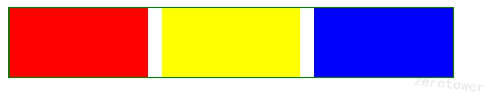
举例说明
- 常用的实现三等分
1 | <div class="parent"> |
1 | .parent { |
如果只有红色的flex:1,则css有:
1 | .child:nth-child(1) { |
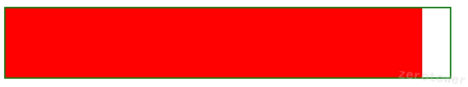
则单个flex:1占满了总长度-gap累计长度。
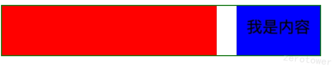
如果子项存在内容了,默认内容宽度
1 | <div class="parent"> |
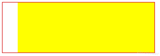
- 固定混合动态
比如常见的侧边栏固定宽度,主内容区填充剩余空间。
1 | <div class="container"> |
1 | .container { |
- 响应式收缩
1 | <div class="container"> |
1 | .container { |
本博客所有文章除特别声明外,均采用 CC BY-NC-SA 4.0 许可协议。转载请注明来源 程序员零塔的小破站!
评论